
A First-Principles Approach to Digital Quran Engagement
A few decades ago, navigation meant paper maps stored in your glove compartment. When GPS devices and smartphones emerged, the obvious next step might have been to digitize those maps; to scan them, store them as images or PDFs, and allow users to pan and zoom.
Instead, modern navigation tools look nothing like paper maps. They automatically detect your location, incorporate live traffic data, provide contextual insights, and reroute you dynamically. You can travel from point A to point B without ever touching the device.
Now consider how we engage with the Quran digitally. We moved from physical mushafs to images of their pages on a screen, still flipping page by page. Some enhancements such as search and audio playback have been layered on, but fundamentally, the experience has barely progressed. We are still changing the medium, not rethinking the experience.
At Tarteel, we are reimagining how Muslims engage with the Quran from the ground up. Doing this well requires solving a problem that most digital products never face: rendering a sacred text with absolute textual fidelity, deep interactivity, and strict spatial consistency, all at once. This post explains why existing digital approaches fall short and how we built a new rendering system to overcome those constraints.
Vision, Constraints, and Memory
Our vision represents a significant departure from the conventional approach. Meanwhile, Muslims are a highly diverse audience, spanning all levels of digital literacy and coming with pre-existing habits and expectations. We aim to provide value universally, which means blending the new with the familiar. Even if we are building cars instead of horses, we may still need to measure power in units of “horsepower.”
This challenge becomes even more pronounced when working with human memory. Memory depends on stability, not constant change. One of the most effective techniques for memorizing the Quran is spatial recall: memorizers form a mental image of each page and can “see” what comes next as they recite. This technique relies on absolute consistency in word placement.
That reliance creates a serious constraint for digital design. Any change in layout, spacing, or pagination risks breaking the spatial memory that memorizers depend on. Reimagining the Quranic experience therefore requires care, as innovation cannot come at the expense of those who applied pre-existing memorization strategies.
Background: What Makes the Quran Unique
To understand the rendering challenges, it is necessary to understand how the Quran is read and memorized.
The Quran’s text has remained unchanged since the completion of its revelation over 1400 years ago and therefore must be preserved precisely. At the same time, additional written elements have been introduced to aid correct recitation for later generations. These include dots, diacritics (tashkeel), stopping symbols (waqf), divisions (eg. juz, hizb, manzil, etc.) and, in some printed editions, color annotations for tajweed rules, thematic connections, or the names of Allah SWT.
These additions exist at different layers: entire lines, full words, or individual characters. Preserving and extending these layers requires precise control over how every letter, word, and line is rendered, not just each page.
At the same time, there is no single “correct” way to distribute Quranic text across pages. Publishers around the world use different layouts, fonts, calligraphers, color conventions, and symbols, reflecting regional teaching methods, historical traditions, and cultural familiarity with particular Quranic scripts. These variations materially affect readability and memorization. As a result, many Muslims are traditionally advised to stick with a single physical mushaf for life, avoiding any change that might disrupt their mental model.
Our Objective
To deliver a truly native digital Quran experience, we needed to reconcile two opposing requirements: fine-grained dynamic control and exact visual and spatial consistency.
What this means in practice is having a solution that:
- Preserves the Quranic text exactly, including all recitation symbols and annotations
- Allows precise, dynamic styling at the level of characters, words, lines, and pages
- Reproduces the exact layout and calligraphic style of existing printed editions
- Exposes word (and ayah) level interaction metadata
- Remains compact enough to bundle multiple editions directly into an app binary
Meeting these requirements unlocks features such as coloring any part of a word that we want (eg. tajweed coloring, mistake highlighting), interactive word and letter tapping and selection, multiple visual themes, smooth adaptation to different screen sizes, and instant experiences without additional downloads.
Existing Digital Approaches
Before building something new, we studied the three approaches commonly used to render the Quran digitally.
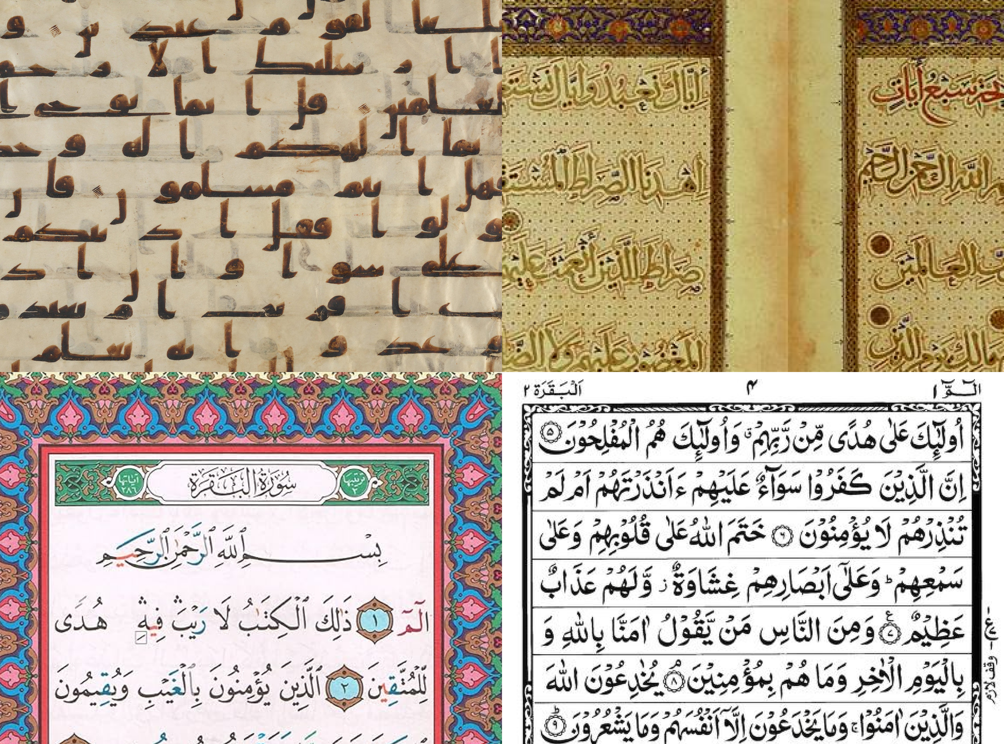
1. Page Images
The simplest approach is rendering each page as a static image taken from a printed mushaf. This preserves calligraphy and layout perfectly. However, it fundamentally breaks interactivity and scalability. Assets are large, styling is static, isolating words or letters is unreliable, and adapting to different screen sizes is constrained by the original aspect ratio.
2. Image-Based Word Segmentation
A more flexible variant of the first approach breaks pages into word-level image components and reassembles them dynamically. This approach has most commonly been applied by embedding the individual word vectors into page-segmented font files because the font files allow for easier distribution and word-level color manipulation during rendering. Word-level interaction and styling becomes easier and more robust, limited layout adjustment becomes possible, all while still preserving calligraphy style. However, asset sizes remain large, manual preparation is extensive, and extending the approach to letter-level styling and interaction (as required for tajweed) introduces significant rendering overhead and even more extensive manual preparation.
3. Text-Based Rendering
The most natural digital approach is rendering the Quran as character-based text using fonts. This offers small asset sizes, precise interaction, and flexible layouts. The downside is aesthetic and spatial: reproducing exact page layouts requires distorting spacing or font size, which compromises the beauty and legibility of traditional calligraphy and disrupts spatial memorization.
Each approach addresses different aspects of the rendering problem, but none resolve it completely.
A New Rendering Model
Our solution combines the strengths of all three approaches by separating the rendering problem into three components: data, fonts, and presentation.
We began with a text-based foundation to keep assets small and enable letter-level control. This required structured data describing exactly which words belong on each line and page for each edition.
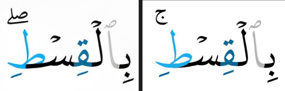
Next, we developed custom fonts for each edition that not only replicate calligraphic style but also support dynamic justification. This works by identifying stretchable components within certain letters - such as the kashida - that can be extended horizontally without distorting the overall shape. Lines can therefore expand to fill available space without adding whitespace or impacting text aspect ratio. This preserves both visual beauty and spatial consistency while keeping font sizes manageable. (For more on this concept, see digitalkhatt.org.)
Finally, we render text, layout data, and fonts directly onto a Skia canvas, enabling advanced styling, animation, and interaction.
The rendering process generally looks like this:
- Allocate the words of the Quran to each page and line according to the selected edition. This allocation is pre-determined and packaged with our app bundle. We’ve open-sourced the data here: https://qul.tarteel.ai/resources/mushaf-layout.
- Determine a font size based on the available space on the screen. This involves obtaining the screen dimensions, subtracting any space already used for headers, footers, margins, etc., and then clamping the resulting dimensions between upper- and lower-bound aspect ratios in order to prevent extra wide horizontal stretching or too much space between lines, both of which reduce readability.
- Iteratively render each line’s words using the font and measure the line width, then expand stretchable letter components based on a prioritization algorithm until the line fills its available width.
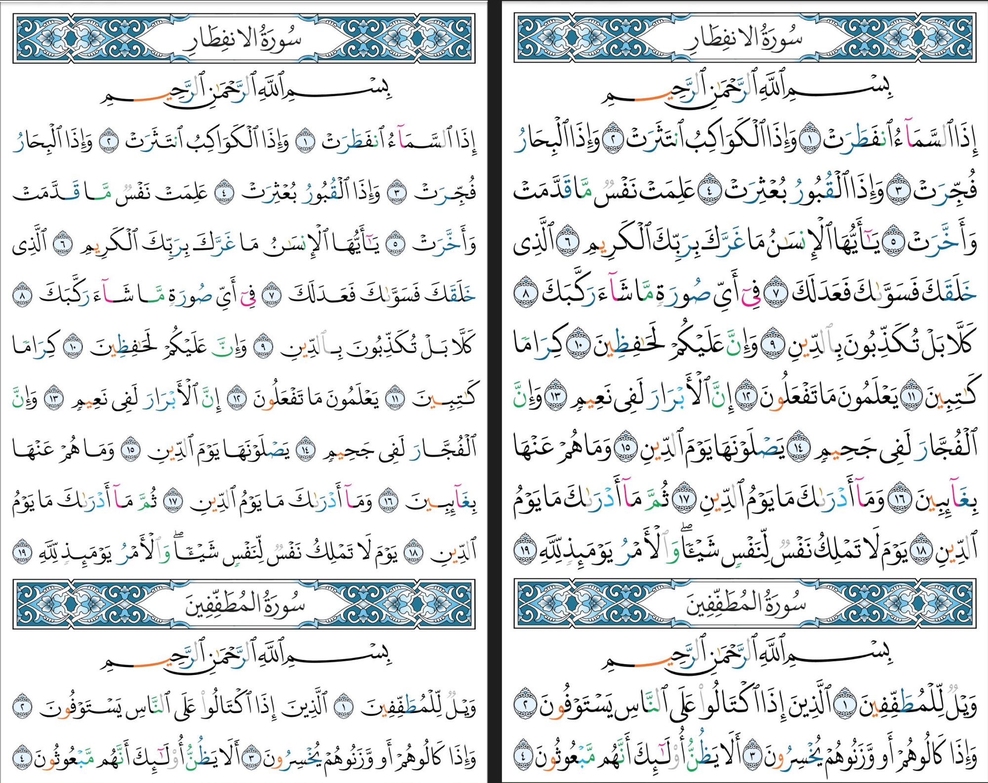
- Apply character-level (eg. tajweed rules) and word-level (eg. recitation mistakes) styling based on regex tajweed patterns and index-based positions.
- Record the coordinates of each word relative to the canvas position in order to support touch interactions.
- Compensate for extra-wide lines, maximum canvas height limits, and other technical issues that we encountered during development.
- Draw the canvas on the screen.
Unique Challenges
The above process, excluding step 6, was adequate for an initial prototype, but subsequent testing and inspection exposed several unique issues that needed to be solved.
Skia painting direction
Skia draws text left-to-right by default, which works well for left-to-right languages such as English but not for Arabic, which is written right-to-left. Although Skia correctly rendered Arabic word order and final letter shapes, it did not draw individual letters in a right-to-left order. This issue surfaced when coloring letters individually to show tajweed rules, as portions of earlier letters would sometimes overlap subsequent ones at joining points, made visible by the differing colors.
We resolved this issue by patching the Skia library, rebuilding the binaries, and packaging those binaries in our app.
Extra-Wide Lines
DigitalKhatt’s dynamic justification currently implements letter stretching but not shrinking. When maximizing font size and screen utilization, some lines exceeded the available width even without stretching. Reducing the font size of the line or page was an option, but testing showed it degraded readability. A longer-term solution under consideration is implementing thinner variants of specific letters to allow shrinking while preserving font size and visual aesthetics; however, this requires additional font research and development. As an interim solution, we apply horizontal compression to the affected lines.
Maximum Canvas Height
Our app supports both page-based and ayah-based Quran rendering, with adjustable font sizes in the ayah-based mode. On iOS (but not Android), viewing long ayahs (e.g., 2:282) at large font sizes caused the app to crash. We discovered that Skia renders canvases as Metal textures on iOS, and Metal enforces a maximum texture height. Long ayahs rendered at large font sizes exceeded this limit, triggering the crash. We fixed this by dynamically checking the maximum allowed height against the expected ayah height and splitting oversized ayahs across multiple sequentially rendered canvases.
Proofreading
Accuracy in preserving the Quran is a non-negotiable requirement. After introducing new editions and fonts, creating custom tajweed regex rules, and engineering a new rendering mechanism, it was necessary to validate the accuracy of the final output. To do so, we executed multiple validation strategies in parallel across different layers of the stack.
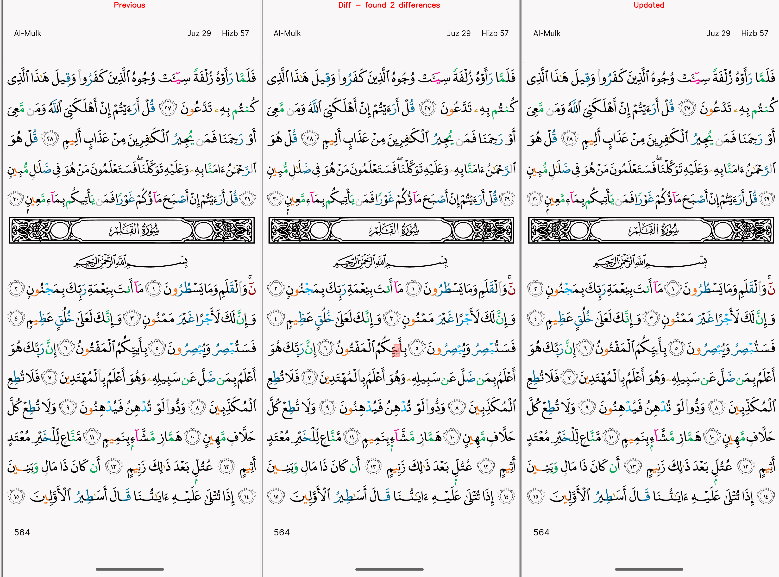
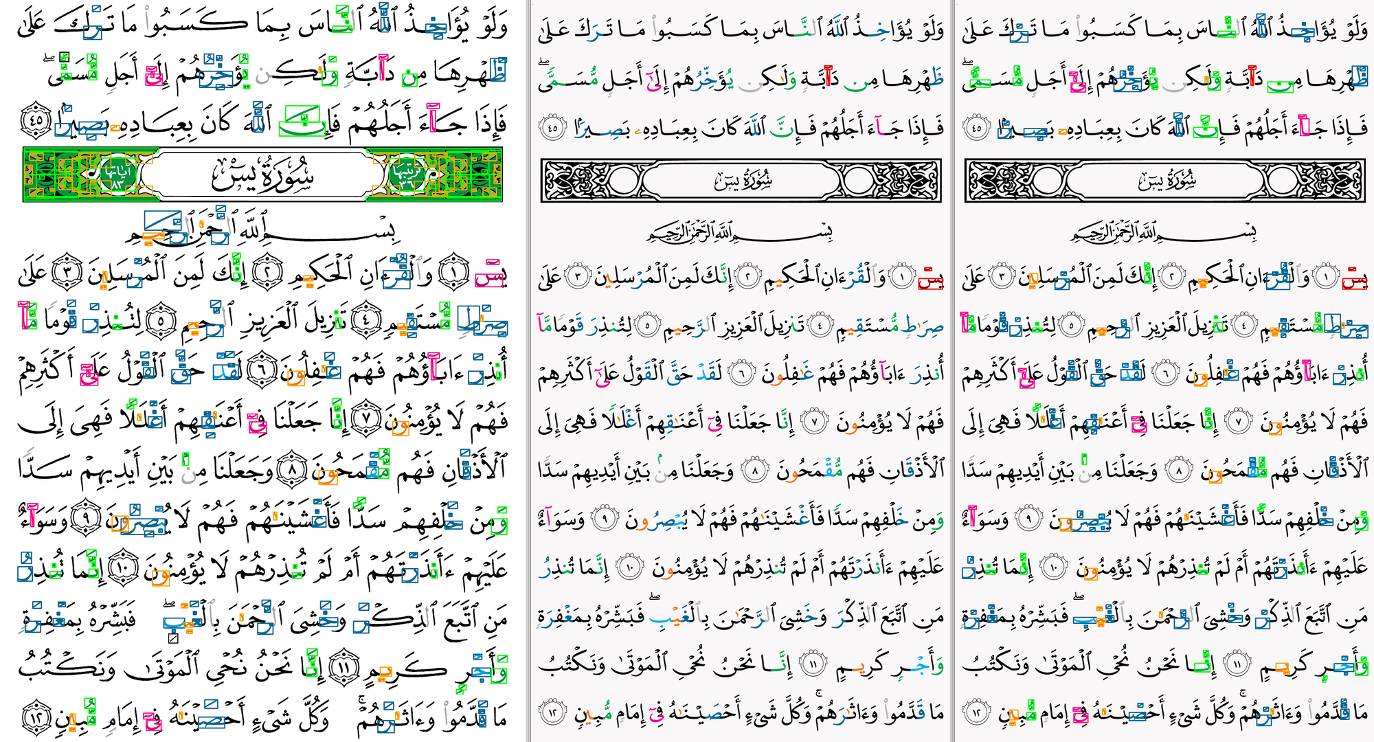
To validate the full system end-to-end, we automated the capture of every page of the Quran, for every edition, as rendered in our application. These images were then reviewed by a team of human proofreaders specializing in Quran verification.
Building on these page images, we also developed a diffing tool to detect any page-level changes whenever adjustments were made to any layer of the rendering stack.
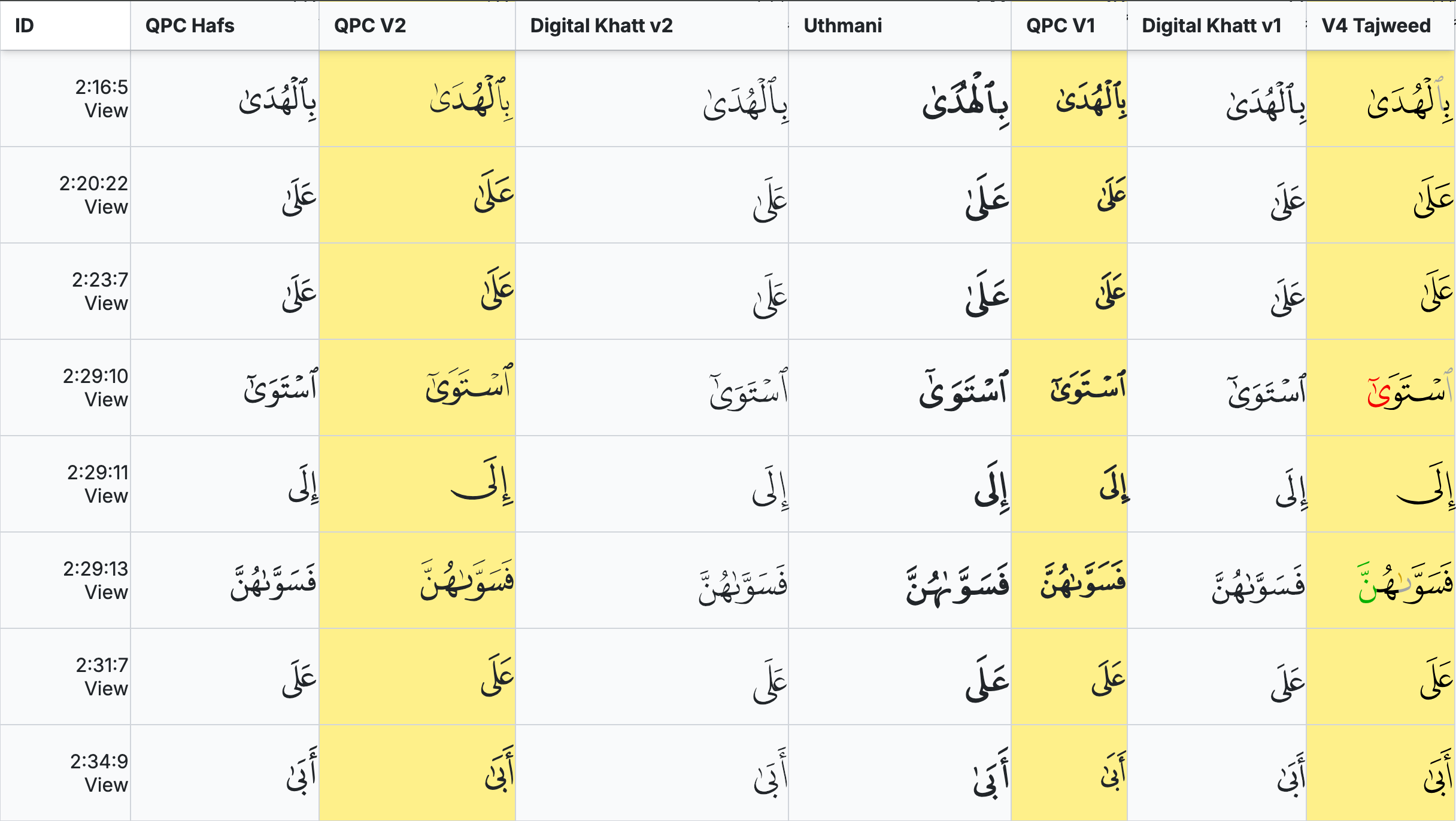
In addition, we implemented a color-based diffing approach to compare our rendered pages against a published tajweed mushaf, allowing us to identify any discrepancies in tajweed coloring.
Finally, at the raw text layer, we built tools to compare Quran text across editions and enumerate all required Unicode characters per edition.
Results in Practice
After some final tuning and performance optimization, the result of our work was released ahead of Ramadan 1446H and has performed beautifully in the hands of millions of people since.
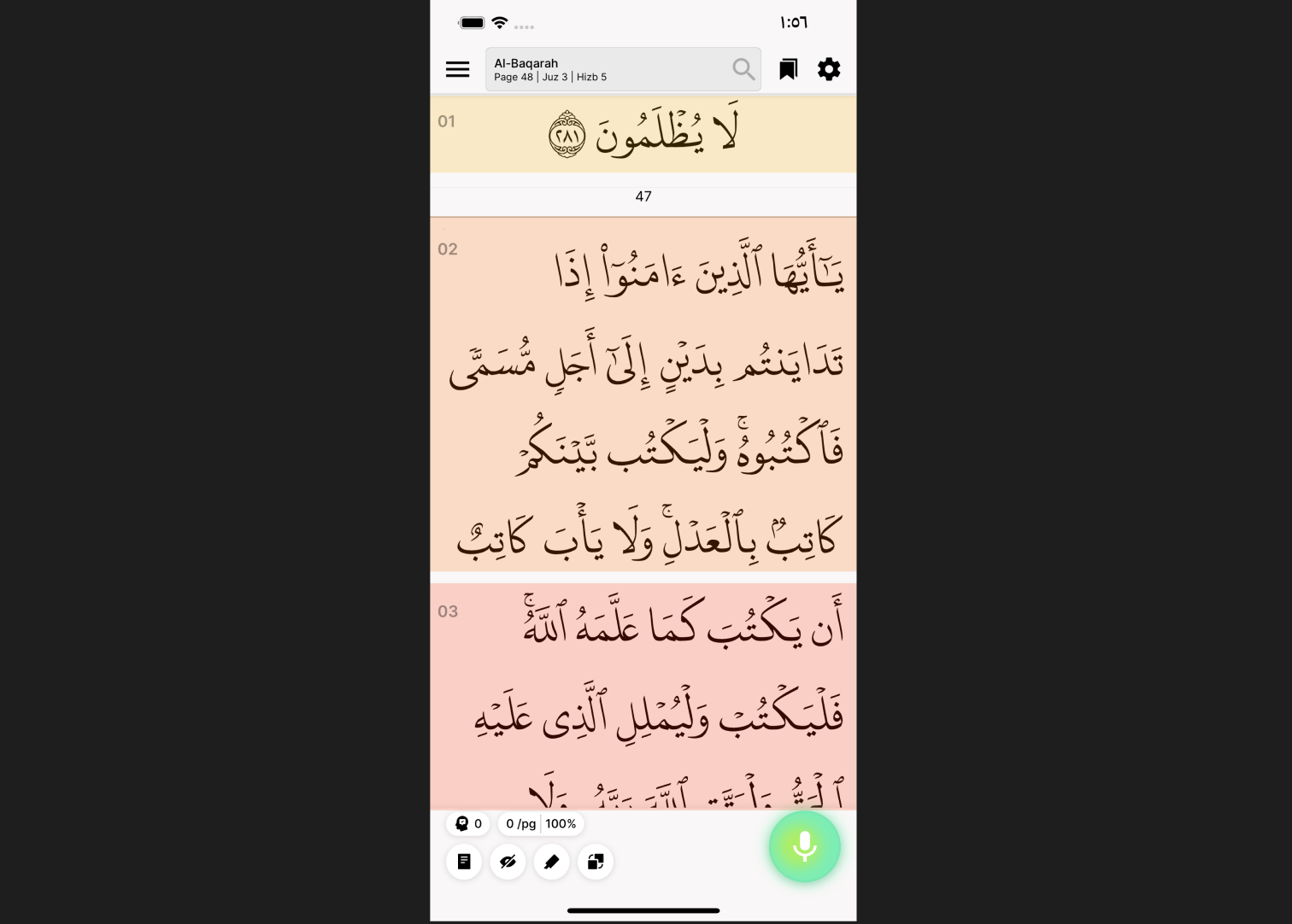
The Tarteel app currently reproduces four published Quran editions, each supporting tajweed coloring, mistake highlighting, hidden words, and precise word-level interaction. All editions are bundled directly into the app without requiring additional downloads. Users experience smooth animation while reciting, accurate spatial consistency, and instant contextual feedback - all without needing to think about the engineering underneath.
That invisibility is intentional. When done correctly, the technology disappears, allowing the focus to remain on the Quran itself. It is only possible because, at its core, Tarteel is a technology company operating at the intersection of world-class technical excellence and the dedication of Muslims striving in service of Islam. If solving problems at this intersection resonates with you, we invite you to apply: https://t.zip/careers.
Special Thanks
This work represents a six-month focused initiative built on nearly a decade of prior iteration by our team and the broader community. First and foremost we thank Allah SWT for giving us the opportunity to serve the blessed Quran through this project and for enabling our efforts. We also thank Dr. Amin Anane of DigitalKhatt, Muhammad Zeeshan Nasar of Mehr Type, our dedicated beta users who provided us invaluable feedback, the wider Tarteel team, and the publishers and developers whose work laid essential foundations for this project.


